IEPB
Killing the doubt with a brand-new look.
Restoring institutional authority for a leader in banking and insurance e-learning
The Challenge
When professional expertise is unassailable but the brand image sparks skepticism, branding becomes a strategic shield. In a hyper-competitive online training market plagued by aggressive digital offers and unreliable actors, a "home-made" look left untouched for ten years is a major business liability. Operating in the strictly regulated world of banking and credit, the stakes were high: strip away amateur codes to foster instant, unshakeable trust.
The Idea & The Strategy
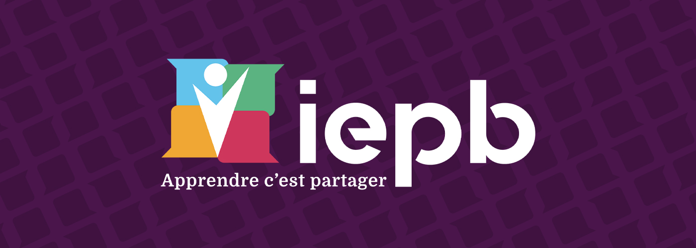
Anchor institutional authority while embracing modern digital learning. The agency centered the rebranding around a transparent, human tagline: “Apprendre c’est partager” (To learn is to share).
The new logo beautifully captures this dual essence: the outer graphic outlines overlapping speech bubbles, representing digital exchange and e-learning. In the negative space at the absolute center, a stylized silhouette of a student with open arms emerges, placing the learner at the heart of the educational journey and their own professional growth.
To fuel this structural evolution, oohhh delivered a comprehensive, high-standard brand asset management system:
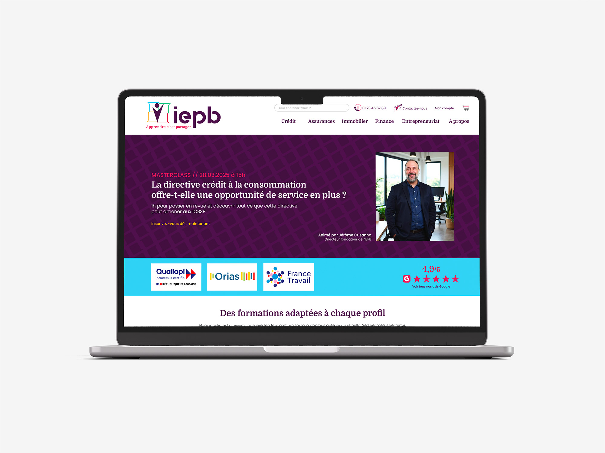
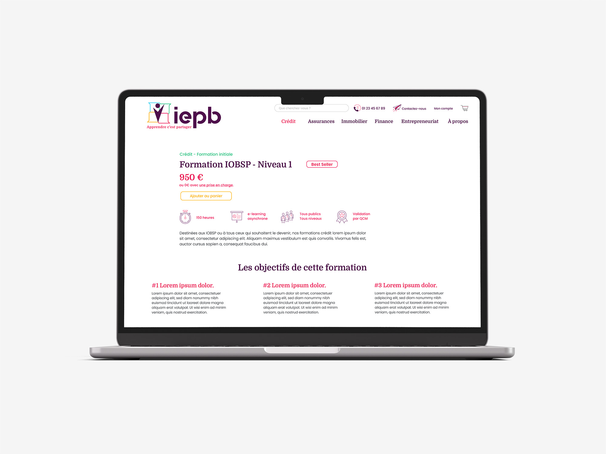
- Visual Codes: A deep Russian Violet color palette delivers academic gravity, balanced with sharp, vibrant accents (Mint, Cerise) for digital vitality. The typographic pair joins the traditional structure of the Domine font with the modern fluidity of Poppins.
- Operational Ecosystem: A complete brand rollout across all touchpoints, including individual and corporate LinkedIn banners, corporate email signatures, commercial marketing templates, and official training certificates.
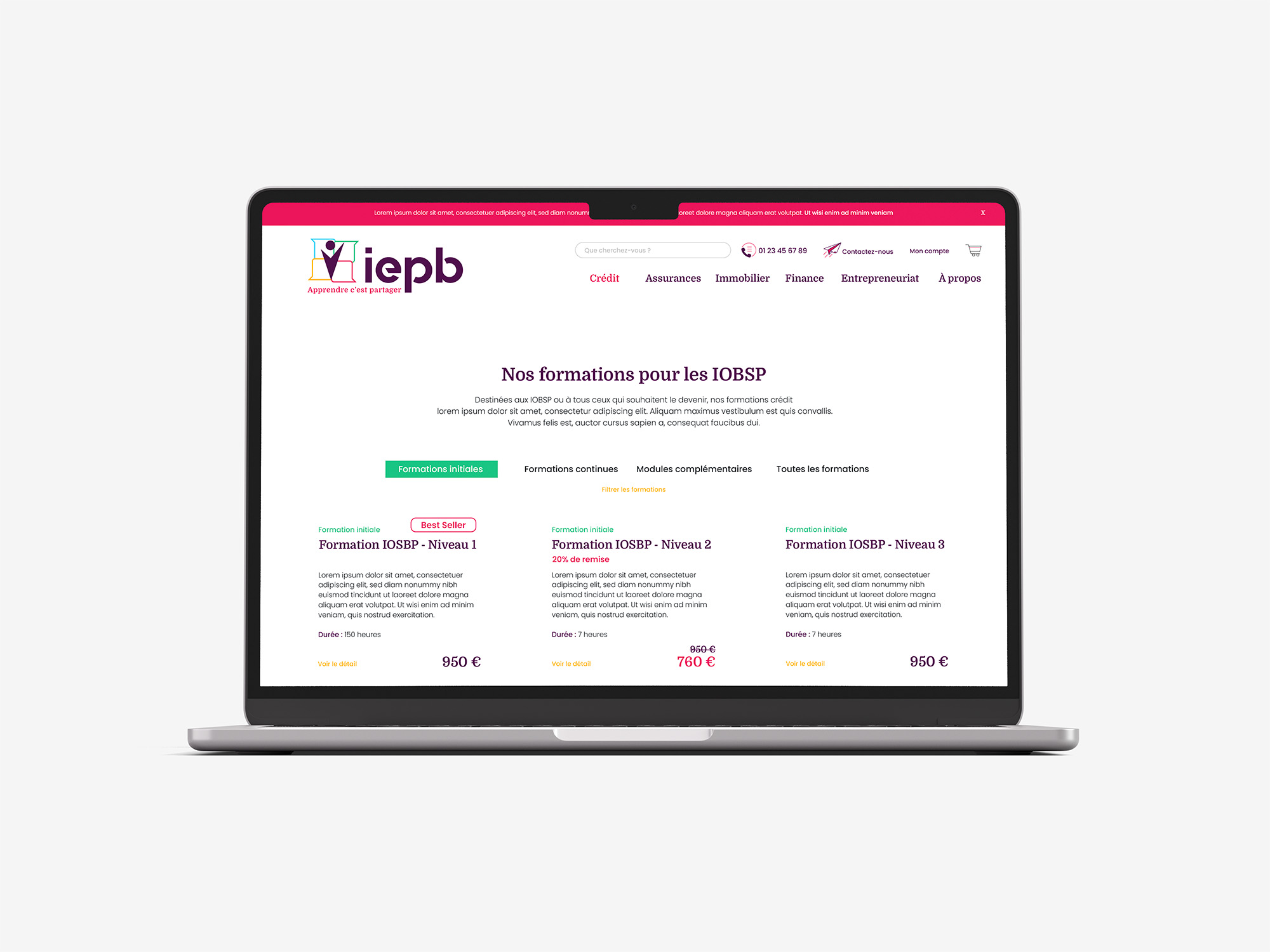
- UI/UX Architecture: The agency completely reengineered the user experience design and custom UI wireframes for the upcoming website, elevating the digital interface to premium web standards before handing off development to the client’s technical partner.
The Verdict
A profound visual turnaround that closes the image gap. By replacing amateur codes with a protective brand territory, oohhh elevated the institute to command the visual presence of a top-tier financial academy—unassailable and future-ready.
The Client
Established over a decade ago, IEPB (Institut d'Études Professionnelles en Bancassurance) is a premier educational institute specializing in compliant online certification and training for banking and credit intermediaries (IOBSP).
Services
- Brand Strategy & Rebranding
- Art Direction & Visual Identity
- UX/UI Design
- Graphic Studio